
그래픽 관련 속성_1
백그라운드
<!DOCTYPE html>
<html>
    <head>
        <style>
            div{
                font-size:100px;
                border:5px solid gray;
                height: 600px;
/*
                background-color:R azure;
                background-image:url("dino.jpg");
                background-repeat : no-repeat;
                background-attachment: fixed;
                background-size:contain;
                background-position:center center;
*/
                background: azure url("dino.jpg") no-repeat fixed center;
            }
        </style>
    </head>
    <body>
        <div>
            Hello world
        </div>
    </body>
</html>
background-
-
color
태그의 박스 영역에 색을 넣는다.
-
image
url의 이미지를 박스 영역 크기만큼 표시한다. 기본적으로 이미지가 패턴처럼 반복해서 표시된다.
-
repeat
repeat : 기본값, 이미지를 반복한다.
no-repeat : 이미지를 반복하지 않는다.
repeat-x : x축 방향으로만 반복한다.
repeat-y : y축 방향으로만 반복한다.
-
attachment
scroll : 기본값, 스크롤에 따라 이미지가 움직인다.
fixed : 스크롤에 영향받지 않고 이미지가 고정된다.
-
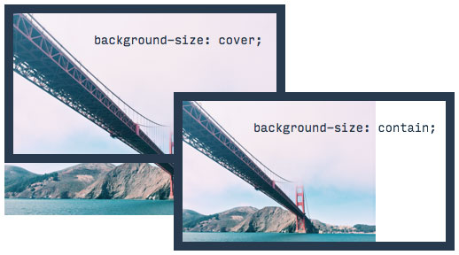
size
크기값을 직접 지정할 수 있다.
cover : 이미지가 영역 전체를 채워서 보여지게 한다.
contain : 이미지를 영역 전체에 보여지게 한다.
-
position
left right center / top bottom center: 조합해서 이미지를 위치에 배치한다.
x%, y%, x, y : 값으로 위치를 배치한다.
축약해서 표현이 가능하다.
순서
background : color, image, repeat, attachment, position;
블렌드
이미지와 이미지를 혼합해서 새로운 이미지를 만들어낸다.
background-blend
백그라운드와 이미지를 혼합한다.
<!doctype html>
<html>
    <head>
        <style>
            .blend{
                height:400px;
                border:5px solid;
                background-color: red;
                background-size:cover;
                background-image: url('dino.jpg');
                background-blend-mode: saturation;
                transition:background-color 1s;
            }
            .blend:hover{
                background-color: rgba(255, 0, 0, 0.5);
                transition:background-color 1s;
            }
        </style>
    </head>
    <body>
        <div class="blend">

        </div>
    </body>
</html>
-
mode
다양한 방식으로 이미지와 배경을 섞어준다.
mix-blend-mode
컨텐츠와 백그라운드를 혼합한다.
<!doctype html>
<html>
    <head>
        <style>
            body{
                background-image: url(dino.jpg);
            }
            .blend{
                font-size:2rem;
                font-weight: bold;
                color:red;
                mix-blend-mode: screen;
            }
        </style>
    </head>
    <body>
        <div class="blend">
            <h1>Lorem ipsum dolor sit amet, consectetur adipisicing elit. Fuga, maiores!</h1>
        </div>
    </body>
</html>
-
mix-blend-mode
지정한 방식으로 컨텐츠와 백그라운드를 혼합한다.
필터
filter 속성은 최신 기능이기 때문에 can i use 로 사용현황을 파악하는게 좋다.
코드를 통해서 효과를 주는것이기 때문에 다양한 동적인 특성을 가질 수 있게 된다.
filter의 기능을 살펴볼 수 있는 사이트
단순한 이미지 뿐만 아니라 비디오나 외부 사이트의 내용을 포함한것에도 실시간으로 필터를 적용시킬 수 있다.
필터
컨텐츠에 다양한 이미지 효과를 적용시킬 수 있다.
<!doctype html>
<html>
    <head>
        <style>
            img{
                transition: all 1s;
            }
            img:hover{
                filter: grayscale(50%) blur(2px);
            }
            h1{
                filter: blur(2px)
            }
        </style>
    </head>
    <body>
        <h1>Dino</h1>
        <img src="dino.jpg" alt="">
    </body>
</html>
filter
-
grayscale
흑백 효과를 준다. %로 값을 정한다.
-
blur
흐려지는 효과를 준다. px 단위로 값을 정한다.
-
transition
전환하는 효과가 지정 시간안에 진행되게 한다.
img태그를 hover로 정해서 마우스를 올렸을 때 효과가 적용된다. 이 때 transition을 1s로 했기 때문에 1초 동안 흑백과 흐려짐 효과가 서서히 적용되기 때문에 자연스러운 동작을 만들어 준다.